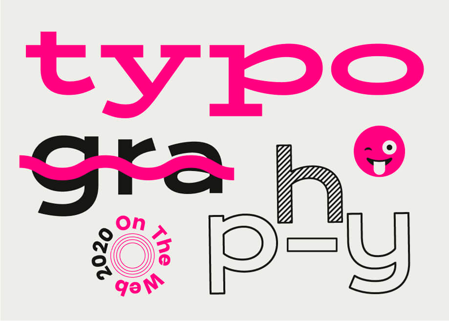
The Anatomy of Fonts: Understanding Typography Basics for Web Design
Typography is the art and technique of arranging type to make written language legible, readable, and visually appealing. Understanding the basics of typography is crucial for web design, as it directly influences how content is perceived and interacted with by users. A strong typographic hierarchy helps guide readers through the text, allowing them to easily find essential information. Key elements to consider include font choice, size, weight, color, and spacing. By mastering these elements, web designers can create a compelling visual experience that enhances usability and user engagement.
When selecting fonts, it's important to consider the different font families available, which include serif, sans-serif, script, and display fonts. Each family serves a different purpose and conveys a unique tone, impacting the overall message of your website. Additionally, aim for a harmonious combination of fonts that complement one another while maintaining readability. Utilizing tools like web-safe fonts and Google Fonts can help ensure optimal performance across various devices, making your typography not just aesthetically pleasing but also user-friendly.
How Typography Can Make or Break Your Website: Key Tips for Success
Typography plays a crucial role in the overall user experience of a website. It encompasses not just the choice of fonts, but also how they are arranged, sized, and colored. A well-chosen typeface can convey an emotional tone and create a visual hierarchy that guides readers through your content effortlessly. Conversely, poor typography can lead to a frustrating experience, often causing visitors to abandon your site in search of a more visually appealing alternative. To ensure your typography works in your favor, prioritize readability by selecting fonts that are easy on the eyes and maintaining adequate line spacing.
Implementing typography best practices can dramatically enhance your website's effectiveness. Here are some key tips for success:
- Limit Font Choices: Stick to two or three typefaces to maintain visual coherence.
- Prioritize Readability: Choose font sizes that are appropriate for various devices, ensuring users can read content comfortably.
- Utilize Contrast: Ensure that text stands out against the background for easy reading, especially for important calls to action.
By mastering these elements of typography, you can create a website that not only looks great but also performs exceptionally well in user engagement and SEO.
Choosing the Right Typeface: What You Need to Know to Enhance User Experience
When it comes to choosing the right typeface, understanding your audience is crucial. Different typefaces convey different emotions and can significantly impact user experience. For instance, a modern sans-serif font may evoke a sense of simplicity and cleanliness, while a serif font can suggest tradition and reliability. Consider conducting user research or A/B testing to see which typefaces resonate most with your audience. This practice can help in selecting a typeface that not only aligns with your brand identity but also enhances usability.
Another important factor to consider is readability. A typeface should be easily legible across various devices and screen sizes. Pay attention to characteristics such as letter spacing, line height, and the overall weight of the typeface. For optimal user experience, aim for a contrasting background that enables your text to stand out. To summarize, when choosing the right typeface, focus on understanding your audience and prioritizing readability to create a seamless interaction between users and your content.